Welcome!
First of all, thanks for stopping by. My hope is to post here on a somewhat regular basis, but I can’t make any promises. I guess you’ll just have to keep checking back for updates. Second, I hope you’re doing alright in these strange, coronavirus times.
I decided to start this blog for a number of reasons, the most personal of which is to start a journey to the “Kinda Good Island” (in the words of Learner Lab founder Trevor Ragan) of writing/blogging/putting ideas out in the open. I’m starting neck deep in the “Feeling Weird Swamp” portion of this path, but I’ve been hiding behind fear and inaction for too long.
With that said, let’s get into this first post!
#savestanfordmvb
In the midst of all the unfortunate happenings in and out of the volleyball world, Stanford’s athletics department announcing they will be dropping their Men’s Volleyball program after the 2020-21 season is certainly a heavy blow for us in the sport. Going to watch high level volleyball matches at Stanford (both men’s and women’s) further stoked my attachment to this sport during high school, which has led me to where I am today. Today’s post will take a look at Stanford Men’s Volleyball Program’s contribution to the USA Men’s National Team (MNT) roster since 2006 (when the USA men began regularly competing in the FIVB World League).
The Data
I pulled data from the USA Volleyball website which includes historical rosters back to 2003 for the MNT. I took travel rosters for FIVB senior level events: World League, Volleyball Nations League, Grand Champions Cup, World Championships, World Cup, and the Olympic Games, including alternates. I did this manually by copying and pasting each roster then cleaning the data up within Excel (I still have a lot to learn about web scraping!).
Once I have the data in a tidy format (each column is a variable, each row is an observation), I read the data into R using the readr package from tidyverse.
# load packages for reading (readr), wrangling (dplyr, tidyr, purrr), and visualizing (ggplot2)
library(tidyverse)

# read data
data0 <- read_csv("./mnthistoricalroster.csv")
head(data0)
## # A tibble: 6 x 7
## name position city state college year competition
## <chr> <chr> <chr> <chr> <chr> <dbl> <chr>
## 1 Matthew Ander~ Opp West Seneca NY Penn State 2019 World Cup
## 2 Aaron Russell OH Ellicott City MD Penn State 2019 World Cup
## 3 Jeff Jendryk MB Wheaton IL Loyola of Chic~ 2019 World Cup
## 4 Mitch Stahl MB Chambersburg PA UCLA 2019 World Cup
## 5 T.J. DeFalco OH Huntington Be~ CA Long Beach Sta~ 2019 World Cup
## 6 Michael Saeta SS South Pasadena CA UC Irvine 2019 World CupI want to show which colleges were represented by our MNT athletes each year, regardless of which competition they played in, so I summarize the data by player, college, and year .
player <- data0 %>%
  group_by(name,college,year) %>%
  summarise(.groups = "drop")
head(player)
## # A tibble: 6 x 3
## name college year
## <chr> <chr> <dbl>
## 1 Aaron Russell Penn State 2015
## 2 Aaron Russell Penn State 2016
## 3 Aaron Russell Penn State 2017
## 4 Aaron Russell Penn State 2018
## 5 Aaron Russell Penn State 2019
## 6 Alfee Reft Hawai'i 2007Each row of player represents each year each player was named to a senior level FIVB competition travel roster. But what I’m really looking for is how many athletes from each college makes up the MNT roster for the year. So we summarize the data further, grouping by college and year.
college <- player %>%
  group_by(college,year) %>%
  summarise(n = n(),
            .groups = "drop")
Each row of college represents how many (n) athletes from each college made at least one FIVB competition travel roster that year.
The Plot
Let’s start building a plot for the data. I want the data to tell the story of how each college is represented through their athletes on the MNT each year. I’ll put year on the x-axis, and college on the y-axis. I’ll use geom_point to show when a college has athletes on the MNT for each year, and use the size of each point to represent how many athletes were on the roster that year.
ggplot(college,
       aes(x = year,
           y = college,
           size = n)) +
  geom_point()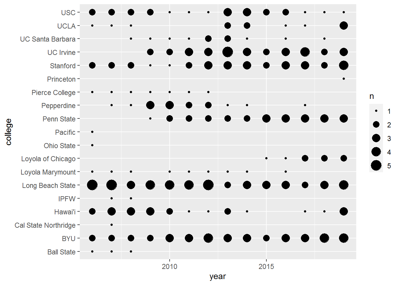
Not bad. I’m not crazy about listing the colleges in alphabetical order and I’d like to see each year flushed out. I’ll rerun the college data frame to include the average number of athletes over the course of this time window. I’ll plot year as a factor as well to get each year to show up on the x-axis.
college <- player %>%

  # get number of years
  mutate(n_years = length(unique(year))) %>%

  # add total athlete representation by college over number of years
  group_by(college) %>%
  mutate(avg = n()/n_years) %>%
  group_by(college,year,avg) %>%
  summarise(n = n(),
            .groups = "drop")

ggplot(college,
       aes(x = factor(year),
           y = fct_reorder(college,avg),
           size = n)) +
  geom_point()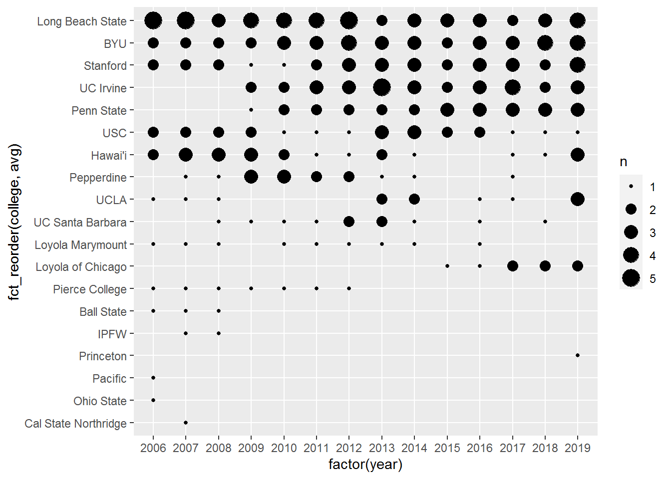
Now college is arranged (using fct_reorder from the purrr package) by avg and we get a good view of which colleges are represented the most on the MNT. Hi, Stanford. I’ll put some final touches on this plot to highlight how impactful Stanford Men’s Volleyball has been to the MNT roster and its success.
I’ll add another variable to the college data frame to draw attention to Stanford’s position on the plot, move the legend below to create more horizontal real estate for the plot, and add some final touch ups to the aesthetics of the plot.
college <- player %>%
  mutate(n_years = length(unique(year))) %>%
  group_by(college) %>%
  mutate(avg = n()/n_years) %>%
  group_by(college,year,avg) %>%
  summarise(n = n(),
            .groups = "drop") %>%
  mutate(col = ifelse(college == "Stanford","Stanford","other"))

ggplot(college,
       aes(y = fct_reorder(college,avg),
           x = factor(year),
           size = n)) +
  geom_point(aes(color = col)) +
  theme_bw() +
  scale_color_manual(values = c("other" = "#b6b1a9",
                                "Stanford" = "#8c1515")) +
  theme(legend.position = "bottom",
        axis.title.y = element_blank(),
        axis.title.x = element_blank(),
        axis.text.y = element_text(size = 12),
        axis.text.x = element_text(size = 12),
        panel.grid = element_blank(),
        plot.title = element_text(size = 16, face = "bold"),
        plot.subtitle = element_text(size = 14,)) +
  scale_x_discrete(guide = guide_axis(n.dodge = 2)) +
  guides(color = FALSE) +
  labs(size = "Number of Men's National Team Athletes",
       title = "USA Volleyball Men's Indoor National Team\nRoster by College",
       subtitle = "Which colleges are USA MNT athletes coming from?",
       caption = "Created by Nate Ngo @natengo1")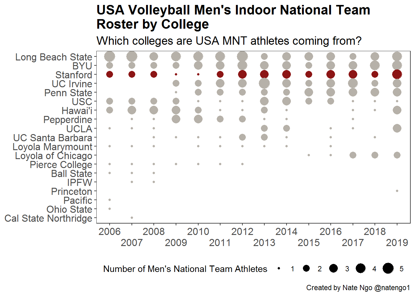
And that’s it! Hopefully this provides another piece of evidence for the positive impact Stanford Men’s Volleyball has had on our sport at a local, national, and global level.
To support the Stanford Men’s Volleyball program, check out the following links:
Change.org Petition