USAV Tech Academy
In case you haven’t heard, for the last three days, USA Volleyball hosted a series of webinars geared towards the data/analytics/technology side of the game which we called the USAV Tech Academy. I, alongside a number of people I feel fortunate to call friends and colleagues, presented and spoke on a range of topics in this realm. If you’re interested in listening to these presentations, you can register ($20 cost) through the previous link and you’ll have access through the end of 2020. There are also a whole host of links and resources for all things volleyball analytics related and more included. This Tech Academy came together in part from an idea to get more people interested in the analytics side of our sport, especially for the underrepresented demographics of those in our male-dominated space. The aptly named “Girl Code” panel featuring Loyola Marymount Assistant Coach & Recruiting Coordinator, Natalie Morgan, University of Denver Assistant Coach, Jessica Aschenbrenner, University of Dayton Director of Operations, Taylor Filzen, and University of Arkansas Director of Operations, Whitney Roth was the highlight of the Tech Academy for me personally, and I hope that it sparks more interest for females to enter into these roles.
As for me, my presentation was focused around an example which I will reproduce here, taking attacking data from a box score and building a visualization that hopefully tells a better story of the match (relative to attacking). During the presentation, I injected bits of basic R knowledge, mentioning concepts like Tidy Data, the Tidyverse, and paying homage to Hadley Wickham. Here, I’ll get a bit more in depth on my thought processes and decisions in creating this visual.
The Data
I simply created a .csv file using Microsoft Excel, taking just the attacking data from Cal Poly’s first Big West match against Long Beach State from 2019 but also including player positions from each team’s respective roster page. I did this for three matches to illustrate the concept of reproducibility during the presentation. The data I used can be found here. Fortunately, the data I used for this post required little to no wrangling, as it is mostly in a tidy format as is. Why this match? Because I am a Mustang. Through and through.
library(tidyverse)

boxscore <- read_csv("./cplbsu.csv")
head(boxscore)
## # A tibble: 6 x 7
## team plyname pos ply kill error att
## <chr> <chr> <chr> <dbl> <dbl> <dbl> <dbl>
## 1 LBSU Nicole Hoff L 3 0 0 0
## 2 LBSU Carly Aigner-Swesey S 10 1 2 8
## 3 LBSU Hailey Harward L 13 0 0 1
## 4 LBSU Erin McFarland MB 15 2 3 10
## 5 LBSU YiZhi Xue MB 16 6 2 13
## 6 LBSU Katie Kennedy OH 18 12 3 31Again, my goal is to create a visual that can show the (attacking) story of a match based solely on box score data. Making comparisons between player performances when listed in table format is generally pretty tough, and the data in a box score is usually not ordered in any meaningful way. The other disadvantage in looking just at the box score, is the use of count data as opposed to rates with many skills. I’d argue that it’s pretty meaningless to understand the difference between two players’ serving performances if, for example, they both have 2 aces and 3 errors, but one server had 5 attempts and the other had 15. Without total attempt data included for many of these skills, it’s difficult to get a real sense of how a player performed throughout the match. At least with attacking data, total attempts are included, so we can normalize the scale we compare attackers by. With this in mind, I’ll look to compare the rate of which attackers earn kills to the rate of which they commit errors.
boxscore <- boxscore %>%
  mutate(kpct = kill/att,
         epct = error/att,
         eff = (kill - error)/att)
Creating variables for kill percentage kpct, error percentage epct, and attack efficiency eff will help the keep the scale of the plot from getting too far in one direction or the other. We’ll keep the original variables to help elaborate the plot as we go.
The Plot
The scatterplot is a very versatile visualization and is great for illustrating the relationship between two continuous variables. So that’s what we’ll start with here, comparing kill percentage to error percentage for each player.
ggplot(boxscore,
       aes(x = kpct,
           y = epct)) +
  geom_point()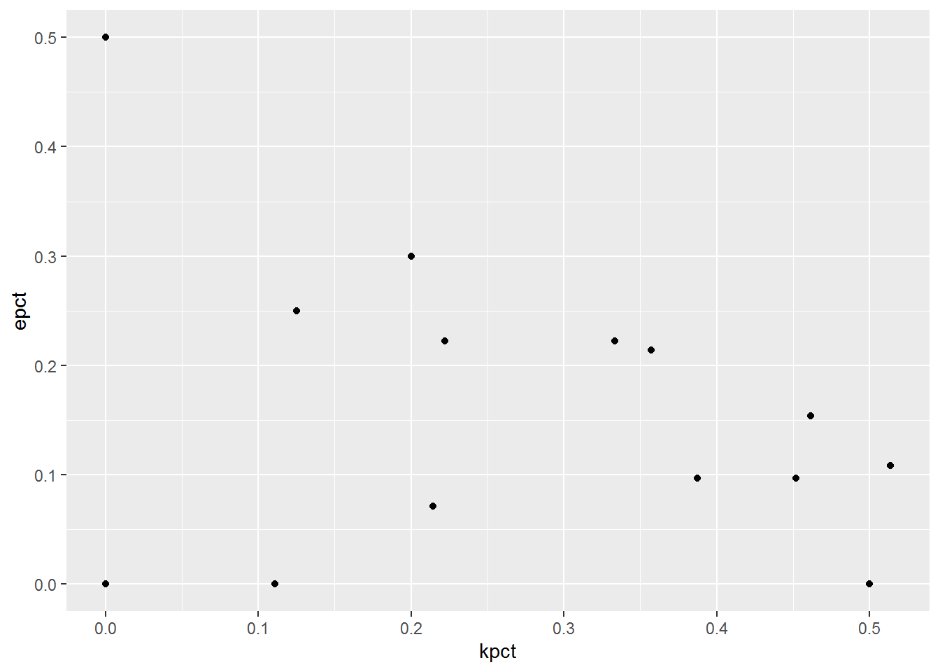
Let’s use some aesthetic options to identify each team (color) and attempts (size) as well as identify each coordinate by player (geom_text). We’ll pass the color and size arguments within the ggplot function, which will pass these arguments to all subsequent functions, as opposed to using these arguments within each geom as we do with geom_text below. See for yourself how moving arguments within aes changes by placing them inside the ggplot function as opposed to placing them inside each specific geom.
ggplot(boxscore,
       aes(x = kpct,
           y = epct,
           color = team,
           size = att)) +
  geom_point() +
  geom_text(aes(label = plyname))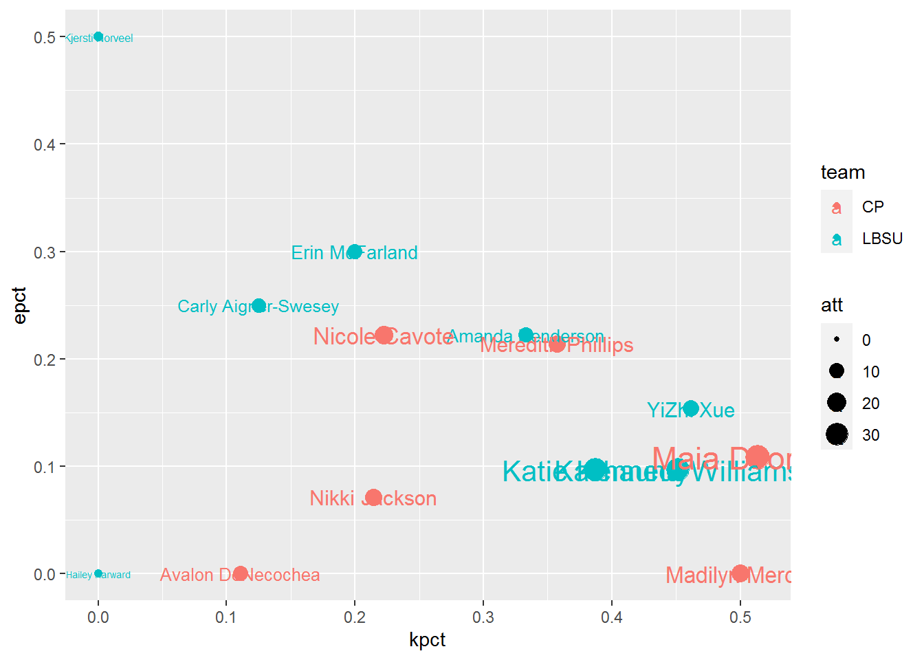
From a storytelling standpoint, I do like how the size of the text almost implies how much of an effect each player had on the match, however it does make it hard to see who made smaller contributions to the match. But we’ll come back to that later. One thing I don’t like about this so far, is how the best attacking performances (highest kill rate, lowest error rate) is at the bottom right of the plot. English speakers read left to right and top to bottom, and so it may help to convey the best performances at the top right, and the worst ones at the bottom left. To achieve this, we can switch the direction of the y-axis with scale_y_reverse.
Overlapping text with points is not ideal either. But of course, there’s a package for that! We’ll load in ggrepel which is a great tool for labelling points while keeping labels from overlapping. And since we’ll have more space to work with, let’s add player positions to the labels as well.
library(ggrepel)

ggplot(boxscore,
       aes(x = kpct,
           y = epct,
           size = att,
           color = team)) +
  geom_point() +
  geom_text_repel(aes(label = paste0(plyname," (",pos,")"))) +
  scale_y_reverse()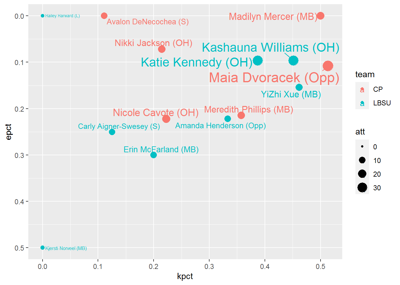
Now we’re getting somewhere, but things look a bit cluttered with all the names, even with geom_text_repel. I’d like to be able to compare apples to apples, so comparing players by position would be ideal. However, with the different substitution rules in the NCAA Women’s game, the distinction between outside hitters and opposites can tend to be a bit blurred. Instead, let’s group outsides and opposites together as Pin Hitters while keeping the Middles in their own group. We’re looking at attacking here, so we’ll narrow the focus to primarily attacking positions. Sorry liberos and setters. We’ll use case_when (instead of a bunch of nested ifelse functions) to create this type variable, then filter for Pin Hitters and Middles only. Let’s also remove players with 0 attempts (or NaN for eff). Should you want to create a grouping to include setters, you can do that within the case_when function. We’ll create “duplicated” plots using the facet_wrap function, dividing by our new type variable.
boxscore <- boxscore %>%
  mutate(type = case_when(pos %in% c("OH","Opp") ~ "Pin Hitters",
                          pos == "MB" ~ "Middles",
                          TRUE ~ "Other")) %>%
  filter(type != "Other" & !is.na(eff))

ggplot(boxscore,
       aes(x = kpct,
           y = epct,
           size = att,
           color = team)) +
  geom_point() +
  geom_text_repel(aes(label = paste0(plyname," (",pos,")"))) +
  scale_y_reverse() +
  facet_wrap(facets = vars(type))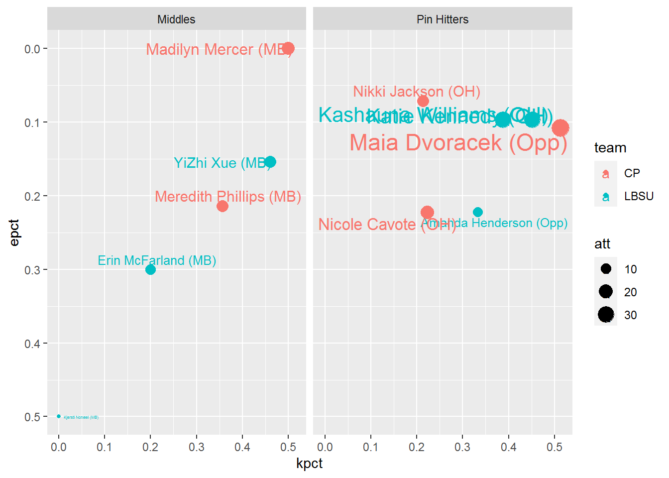
I like how the clutter is reduced a bit, dividing the positions with facets, but there’s still a bit of clutter with the Pin Hitter grouping. While size is a nice way to convey attempts, I’m not sure having both the text and point size is necessary. Also, while normalizing our comparisons with kill and error rates, it is still valuable to know the actual counts of kills, errors and attempts for each player. Let’s add that information into our labels, and hope geom_text_repel can keep our labels away from each other cleanly. We’ll move the size argument out of ggplot and into the geom_point function so that the point size changes relative to att, but the text won’t. Since kills occur more than errors on average, let’s change the direction of the facets from columns to rows. We’ll substitute the facet_wrap function for facet_grid and specify the vars by rows.
ggplot(boxscore,
       aes(x = kpct,
           y = epct,
           color = team)) +
  geom_point(aes(size = att)) +
  geom_text_repel(aes(label = paste0(plyname," (",pos,")\n",            # \n call for a new line
                                     kill," | ",error," | ",att,"\n",   # within a text string
                                     round(eff,3)))) +
  scale_y_reverse() +
  facet_grid(rows = vars(type))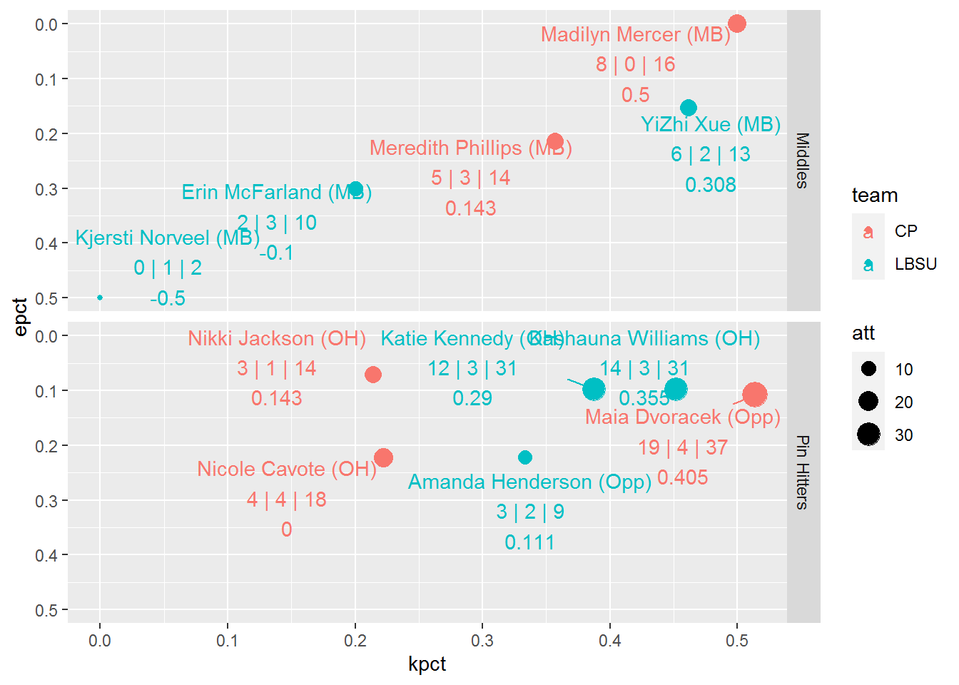
Depending on how much screen real estate you have, geom_text_repel may not be keeping labels away from each other as much as we’d like, especially with all the information we’ve added. We can add the force argument within geom_text_repel to increase repulsion between overlapping labels. Let’s also move the legend to the bottom of the plot to allow for more plot width (legend.position within theme). The background color and grid lines make the plot a bit busier than needed, so let’s simplify the background color (theme_bw) and remove the grid lines (panel.grid also within theme).
ggplot(boxscore,
       aes(x = kpct,
           y = epct,
           color = team)) +
  geom_point(aes(size = att)) +
  geom_text_repel(aes(label = paste0(plyname," (",pos,")\n",
                                     kill," | ",error," | ",att,"\n",
                                     round(eff,3))),
                  force = 3) +
  scale_y_reverse() +
  facet_grid(rows = vars(type)) +
  theme_bw() +
  theme(legend.position = "bottom",
        panel.grid = element_blank())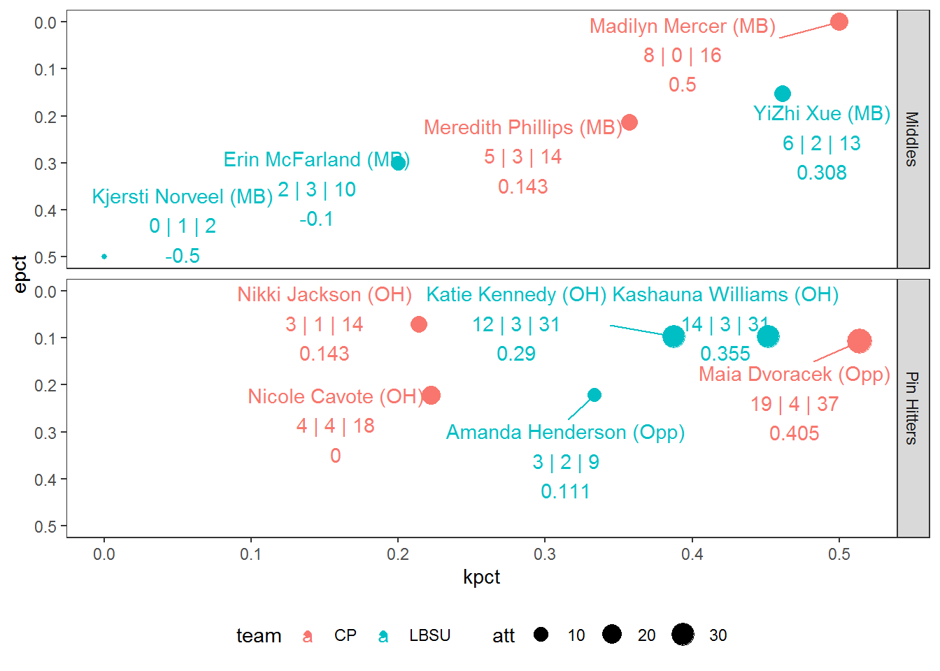
The final functional pieces we’ll add are median lines for kill percentage and error percentage to categorize performances within this match. We’ll use geom_hline and geom_vline to do this. We’ll make these lines dotted (linetype = 2) and place these lines furthest back in the plot. To achieve this, the order in which we call the function matters, and so we’ll place this towards the top of the list of functions we call.
Aside from that, I feel good about the functionality of the plot at this point, and finally let’s top this off with some cleaner titles (labs) and customized colors (scale_color_manual using Hex Color Codes).
ggplot(boxscore,
       aes(x = kpct,
           y = epct,
           color = team)) +
  geom_hline(aes(yintercept = median(epct)),
             color = "gray",
             linetype = 2) +
  geom_vline(aes(xintercept = median(kpct)),
             color = "gray",
             linetype = 2) +
  geom_point(aes(size = att),
             alpha = .75) +
  scale_y_reverse() +
  scale_color_manual(values = c("CP" = "#154734",
                                "LBSU" = "#707271",
                                "UGA" = "#BA0C2F",
                                "STAN" = "#8c1515",
                                "WIS" = "#646569")) +
  geom_text_repel(aes(label = paste0(plyname," (",pos,")\n",
                                     kill," | ",error," | ",att,"\n",
                                     round(eff,3))),
                  force = 3) +
  theme_bw() +
  facet_grid(rows = vars(type)) +
  theme(panel.grid = element_blank(),
        legend.position = "bottom",
        plot.title = element_text(size = 16,face = "bold")) +
  labs(x = "Kill Percentage",
       y = "Error Percentage",
       title = "Box Score - Attack",
       color = "Team",
       size = "Attempts")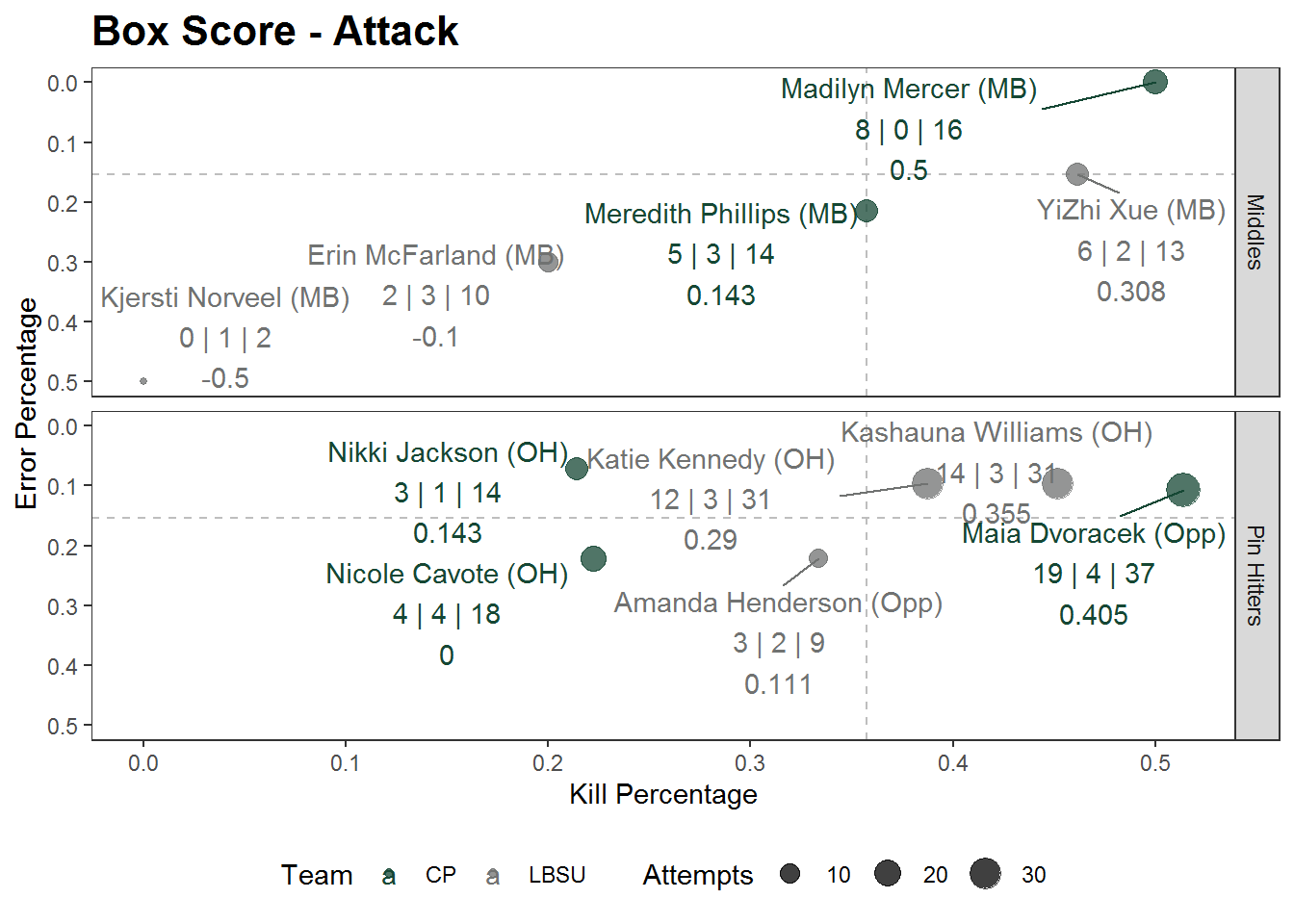
Final Thoughts
Instead of fumbling through a list of player performances on a box score, we have now created a plot that visualizes this same data with more context, using the space of a scatterplot to convey comparisons between players in a more meaningful way.
Furthermore, one of the great advantages of building such a plot in R is reproducibility. With the same code, we can create a similar visual for any other match by reading data in a similar format as what we did with the cplbsu.csv file. To illustrate this point, we’ll use the box score from the 2019 NCAA DI Women’s National Championship match between Stanford and Wisconsin.
# load packages
library(tidyverse)
library(ggrepel)

# read data
boxscore <- read_csv("./stanwi.csv")

boxscore <- boxscore %>%
  mutate(kpct = kill/att,
         epct = error/att,
         eff = (kill - error)/att) %>%
  mutate(type = case_when(pos %in% c("OH","Opp") ~ "Pin Hitters",
                          pos == "MB" ~ "Middles",
                          TRUE ~ "Other")) %>%
  filter(type != "Other" & !is.na(eff))

ggplot(boxscore,
       aes(x = kpct,
           y = epct,
           color = team)) +
  geom_hline(aes(yintercept = median(epct)),
             color = "gray",
             linetype = 2) +
  geom_vline(aes(xintercept = median(kpct)),
             color = "gray",
             linetype = 2) +
  geom_point(aes(size = att),
             alpha = .75) +
  scale_y_reverse() +
  scale_color_manual(values = c("CP" = "#154734",
                                "LBSU" = "#707271",
                                "UGA" = "#BA0C2F",
                                "STAN" = "#8c1515",
                                "WIS" = "#646569")) +
  geom_text_repel(aes(label = paste0(plyname," (",pos,")\n",
                                     kill," | ",error," | ",att,"\n",
                                     round(eff,3))),
                  force = 3) +
  theme_bw() +
  facet_grid(rows = vars(type)) +
  theme(panel.grid = element_blank(),
        legend.position = "bottom",
        plot.title = element_text(size = 16,face = "bold")) +
  labs(x = "Kill Percentage",
       y = "Error Percentage",
       title = "Box Score - Attack",
       color = "Team",
       size = "Attempts")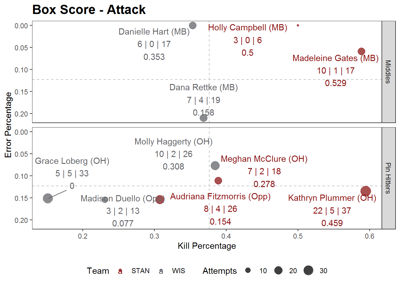
Does this visual tell the story of your match(es)? Share your version with me on Twitter and let me know what you think. Or even better, share how you would improve this plot!