Growth of High School Boys’ Volleyball
After my first post about #savestanfordmvb, naturally I wanted to look at trends in participation for high school boys’ volleyball. My first stop in looking at this particular topic was the First Point Volleyball Foundation website. First Point was started by my boss, USA MNT and UCLA Men’s Volleyball head coach, John Speraw and is committed to growing boys’ and men’s volleyball in the US by assisting in the creation and development of high school and college programs. Their website provides some data showing the increasing rates of both boys’ volleyball participants and teams, and I wanted to dive into that data a little deeper and see if I could spruce that visualization up a bit.
The Data
Fortunately, the data is easily available at the National Federation of High School Associations (NFHS) website where you can select any and all sports participation data back to the 2002/2003 school year (conveniently, my freshman year of high school!). Without filtering the data, let’s download all the available data the site has to offer, name the file nfhs.xlsx, and place the file in our working directory. Now let’s load the tidyverse package as well as readxl to read files from a Microsoft Excel format.
library(tidyverse)
library(readxl)

boysvb <- read_xlsx("nfhs.xlsx")
head(boysvb)
## # A tibble: 6 x 7
## Year State Sport `Boys School` `Girls School` `Boys Participa~
## <chr> <chr> <chr> <dbl> <dbl> <dbl>
## 1 2018~ AL Adap~ 0 0 0
## 2 2018~ AL Adap~ 0 0 0
## 3 2018~ AL Adap~ 0 0 0
## 4 2018~ AL Adap~ 0 0 0
## 5 2018~ AL Adap~ 0 0 0
## 6 2018~ AL Adap~ 0 0 0
## # ... with 1 more variable: `Girls Participation` <dbl>A quick look at the data shows exactly what we saw on the website: the Year, State, Sport, Boys School - the number of boys teams of that sport, Girls School - the number of girls teams of that sport, Boys Participation and Girls Participation - the number of athletes of each gender.
Now, the First Point Foundation’s goal is to portray this data in the most positive light possible, and while I don’t doubt that boys’ volleyball’s growth is showing strong improvement, I wanted to get some different views of what the growth looks like, particularly over time and by state. With that said, let’s do a little exploratory data analysis to see what this growth looks like since my freshman year of high school.
# narrow data down to volleyball and number of boys participants

vb_exp <- boysvb %>%
  filter(Sport == "Volleyball") %>%
  select(Year,State,Sport,`Boys Participation`) %>%

# see totals from 2002/2003 to 2018/2019 by state
  group_by(State) %>%
  summarise(total = sum(`Boys Participation`)) %>%

# then order from largest to smallest
  arrange(desc(total))

vb_exp
## # A tibble: 51 x 2
## State total
## <chr> <dbl>
## 1 CA 272489
## 2 IL 111864
## 3 NY 67626
## 4 PA 61506
## 5 NJ 46390
## 6 OH 39265
## 7 MA 37827
## 8 FL 36386
## 9 AZ 26889
## 10 WI 24750
## # ... with 41 more rowsCA and IL clearly lead the way in total participants since the 2002/2003 school year, then we have a solid showing from the Northeast (NY, PA, NJ, MA) alongside OH, FL, AZ, and WI. However, there are certainly a significant grouping of states that have had no history of boys’ volleyball in this period. At this point, I’m thinking being able to depict where the growth is happening geographically could be interesting.
Initially, my thought was to plot a map of the US and use color to show growth. Googling around led me to the package {fiftystater}. A little bit of maneuvering with state identification is required here, so I created a file named states.csv as an index for the state abbreviations we currently have to correpsond with the way the {fiftystater} package identifies states.
# load package
library(fiftystater)

# load file with state abbreviations and names
states_index <- read_csv("states.csv")

# load fifty_states data frame from {fiftystater} package
fifty_states <- fiftystater::fifty_states

# filter data similarly as above but also from 2002/2003 and 2018/2019 only
boysvb_map <- boysvb %>%
  filter(Sport == "Volleyball" &
           Year %in% c("2002/2003","2018/2019")) %>%
  select(Year,State,Sport,`Boys Participation`) %>%

# join `states` data frame with only `state_ab` and `fifty_stater` columns
  left_join(states_index %>% select(state_ab,fifty_stater),

# match `State` column from boysvb to `state_ab` from `states_index` data frame
            by = c("State" = "state_ab"))

# start plot (taken from https://github.com/wmurphyrd/fiftystater)
ggplot(boysvb_map,

       # get map_id from `fifty_stater` column of `boysvb_map`
       aes(map_id = fifty_stater)) +

  # fill state color with `Boys Participation`
  geom_map(aes(fill = `Boys Participation`),

           # add state border lines
           color = "black",
           map = fifty_states) +
  expand_limits(x = fifty_states$long, y = fifty_states$lat) +
  coord_map() +

  # change color scale, states with low values in white, high values in blue
  scale_fill_gradient(low = "white", high = "blue") +
  scale_x_continuous(breaks = NULL) +
  scale_y_continuous(breaks = NULL) +
  labs(x = "", y = "") +
  theme(legend.position = "bottom",
        panel.background = element_blank()) +

# add faceting for start and end years
  facet_wrap(vars(Year))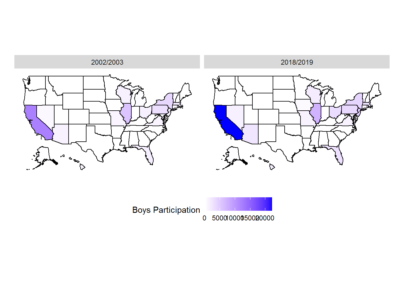
As we saw in the summarized data above, the participation numbers in California dwarf those of other states, and so while this map highlights the significant growth and overall participation of California, it doesn’t capture the gains being made in other states. This plot also jumps between the bookend years of 2002/2003 and 2018/2019, and doesn’t capture what happened in the 16 years between.
While scrolling through Twitter last week, specifically #tidytuesday, I stumbled across Jack Davison’s #tidytuesday tweet and really liked the way the facets were placed to geographically represent Europe while still being able to use bar charts to make comparisons between countries. Fortunately, Jack followed up that tweet noting his use of the {geofacet} package.
# load package
library(geofacet)

# filter data similarly as above without Year restriction
boysvb_map <- boysvb %>%
  filter(Sport == "Volleyball") %>%
  select(Year,State,Sport,`Boys Participation`)

# create a line graph to show participation by state
ggplot(boysvb_map,
       aes(x = Year,
           y = `Boys Participation`,
           group = State)) +
  geom_line() +

# facet by state using {geofacet}, allow for y-axis to be variable
# so other states are not subject to the same scale as CA
  facet_geo(facets = vars(State),scales = "free_y") +

# aesthetic edits to make the plot readable on html
  theme_bw() +
  theme(axis.text.y = element_text(size = 4),
        axis.title.y = element_blank(),
        axis.text.x = element_blank(),
        axis.ticks.x = element_blank(),
        strip.text = element_text(size = 6),
        panel.grid = element_blank()) +

# use `pretty_breaks()` from {scales} to lessen axis text clutter
# n = 3 argument for desired number of breaks
  scale_y_continuous(breaks = scales::pretty_breaks(n = 3))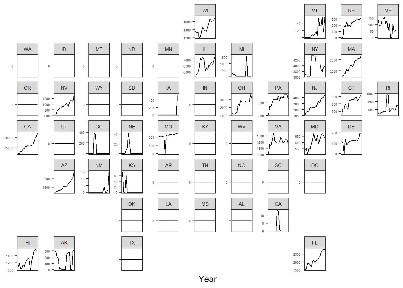
Much better! This illustrates the story of the upward trend in participation for high school boys’ volleyball since 2002/2003, while also showing where these the sport is growing geographically as well. Let’s clean this up a bit with more descriptive titles and play around with the colors.
ggplot(boysvb_map,
       aes(x = Year,
           y = `Boys Participation`,
           group = State)) +
  geom_line() +
  facet_geo(facets = vars(State),scales = "free_y") +
  theme_bw() +
  theme(axis.text.x = element_blank(),
        axis.text.y = element_text(color = "white", size = 4),
        axis.title.x = element_text(color = "white",face = "bold",size = 6),
        axis.title.y = element_blank(),
        axis.ticks = element_line(color = "white"),
        axis.ticks.x = element_blank(),
        panel.grid = element_blank(),
        strip.background = element_rect(fill = "black"),
        strip.text = element_text(color = "white", face = "bold", size = 6),
        legend.position = "bottom",
        plot.background = element_rect(fill = "black"),
        text = element_text(color = "white"),
        plot.title = element_text(face = "bold",size = 8),
        plot.subtitle = element_text(size = 6)) +
  scale_y_continuous(breaks = scales::pretty_breaks(n = 3)) +
  labs(x = "Year (2002 through 2019)",
       title = "High School Boys' Volleyball Participation Trends (2002 to 2019)",
       subtitle = "Note: Changing Y-Axis Values",
       caption = "Created by Nate Ngo @natengo1")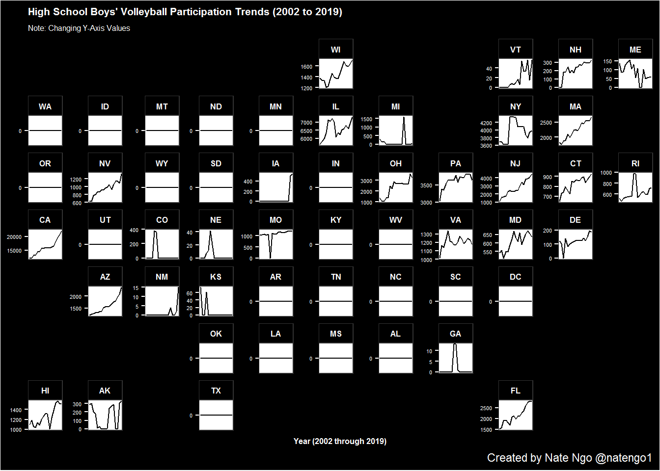
A slightly higher resolution final product can be found on my original tweet.
And that’s it.. Hopefully we can get back to growing the game again soon!